Analysing my cycle rides and runs on Strava
Introduction
In summer 2017 I started using Strava to document my cycle rides. It includes useful metrics on where and how far I've been and what speed I'm doing over different segments. At the time I cycled around three times a week and cycling was my main form of exercise. However as the nights drew in I started doing more running and it has now more-or-less replaced cycling as my main exercise. A lot of my early runs were not recorded on Strava but when I saw some attractive visualisations of Strava data from Marcus Volz I decided to replicate some of his work, as well as analysing my average speeds.
What Marcus did
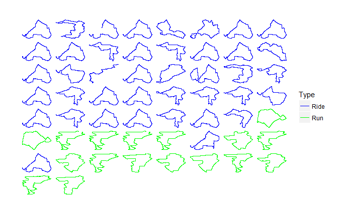
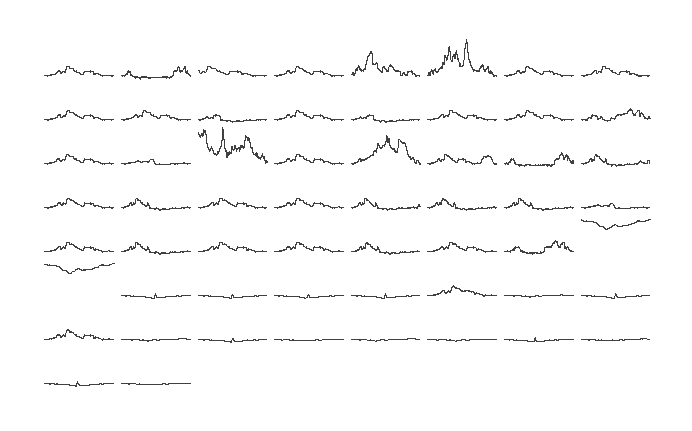
Marcus has produced an R package which gets some .gpx files (the files which Strava uses to analyse your activity) and does some pretty visualisations including small multiples of maps, elevation and graphs of when activity takes place.
What I did
I started by replicating Marcus' work. However the distances seemed a little off and upon inspection, the latitude of my activity was limited to five decimal places rather than the six which were present in the gpx files. This seems trivial, but was causing my activities to vary in distance from what Strava's app said, sometimes by up to 20%.
I rewrote the code to import the gpx files in Python (my preferred data wrangling language) and to convert them to csv for importing into R for visualisation.
Visualising and analysing the results
Here are small multiples of maps and elevation


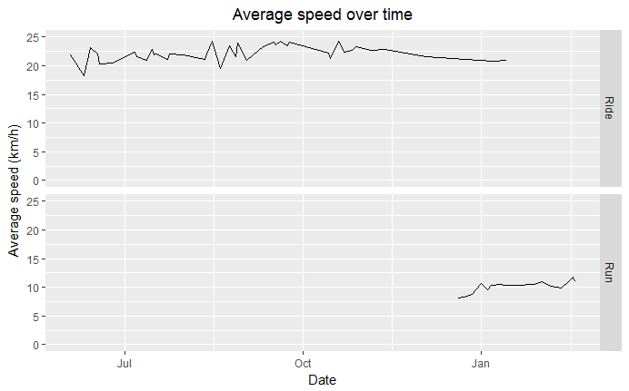
I was interested to know if my average speeds were increasing over time. Anecdotally I suspect my cycling speeds increase between spring and autumn as the weather is better for cycling. This is borne out by my analysis as my average cycling speed seems to increase from about 20 km/h in June to around 25 km/h in October. I also thought my running speed was improving since taking up running around October, and I'm pleased to see that it has.

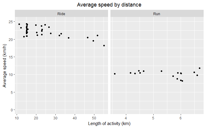
I think I cycle slower over longer rides so I compared my average speeds against distance and was pleased to see that the graph reflects this.

Get the code
My code is available on Github and I always welcome comments or suggestions for improvements. Marcus' R package, the inspiration for this work, is also available.
